
Monday, November 23, 2015
Brochure Presentation
Wednesday, November 11, 2015
Event Poster Critique

After critiques in class, I will probably play around with the highlights and shadows on Dille, the pickle. Making my slogan bigger and possibly seeing our "big dill" looks in all capital letters. Eventually adding the date and rest of information. Also adding maybe a website about national pickle day (if there is such a thing, if not make one). Also, playing around with a background or boarder,
Monday, November 9, 2015


Thursday, November 5, 2015
Event Poster Rough Presentation

For my event poster I will be doing National Pickle Day. Using a few pickle puns and announcing the date. I plan to create my pickle using vector art and make him like a cartoon character and bringing him to life. I decided to use National Pickle Day because it's different and not many people know that such a day exist.
"Dill-ightful"
"It's kind of a big Dill."
"What's the dill Pickle?"
"I'm a bit of a pickle"
"Just dill with it."
Monday, October 26, 2015
Cover critiques

After going over in class I intend to add more text to the left side of the page maybe bring up the paint pallet a little more as well. Make the bar code slightly smaller. Add another feather stories page numbers and possibly play with the coloring of the fonts.
Monday, October 19, 2015
Cover Rough Presentation

Monday, October 12, 2015
Editorial progress

Sunday, October 4, 2015
Editorial Brief

For my editorial layout I intend to it upon 4 pages, a single page, double page spread, and back to a single page. The first page, the beginning of the article I intend to have it a full page image of starry night. The article is going to be a piece of Van Gogh, merely because he is my fav. Also, on the image I will have a captivating title. And then moving on to the actual article, have some cool artsy typeface for 'Van Gogh' which is going to spread across the top of page 2, just to play around with some typography. Then continue with a basic 3 column layout with a image in the 3rd column of both pages 2-4.
Tuesday, September 22, 2015


Wednesday, September 16, 2015
Screenshots of progress
This is the design of the front cover. I decided to use the same image on the top right and bottom left to give it a tiled look. Also, I decided to stick with a simple design. Using black and white with a little bit of color from the red and orange in the images making the color stand out even more.


Nameplate

Wednesday, September 2, 2015
Newsletter Concept
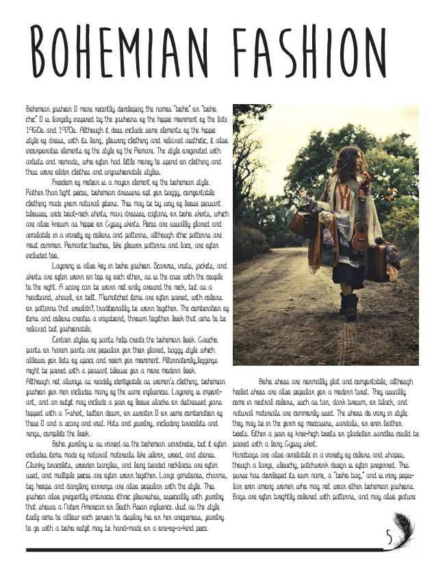
For my newsletter, I have decided to base it on the world of fashion, possibly a specific fashion design company and maybe highlight one specific designer. Have the stories that are behind the deigns or if there is one. And have images as the designs come to life from the beginning sketches. I'll focus on the style of bohemian/hippie because that's the fashion I know best.
My newsletters audience will be those who are interested in learning about the "behind the scene" of the fashion. And those who love the bohemian style.
I've already thought about how I will have the layout set up for the cover. I'll have Boho as the title. And under the title have a few images of the style from the designer I plan to highlight in the newsletter. And then have an image of the Highlighted designer.
Subscribe to:
Comments (Atom)